A conversation with Eric Petschek, friend and interior designer of “The Palace” (the endearing term we coined for the 384 square foot studio apartment in Manhattan I bought and renovated over the last two years and change).
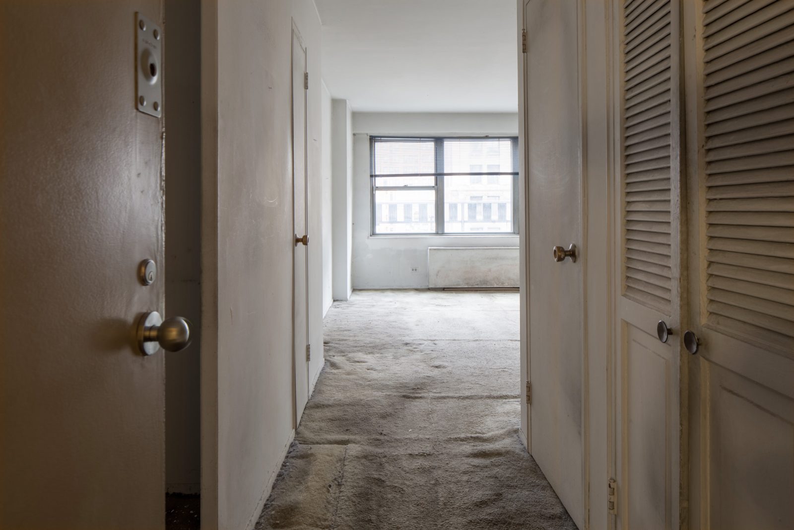
AG: So we have to take this way back, to December 2016 when I first saw this apartment that clearly needed work. And I dragged you to come see it on my second viewing and I was like, “Am I crazy?? Does this place have potential?”
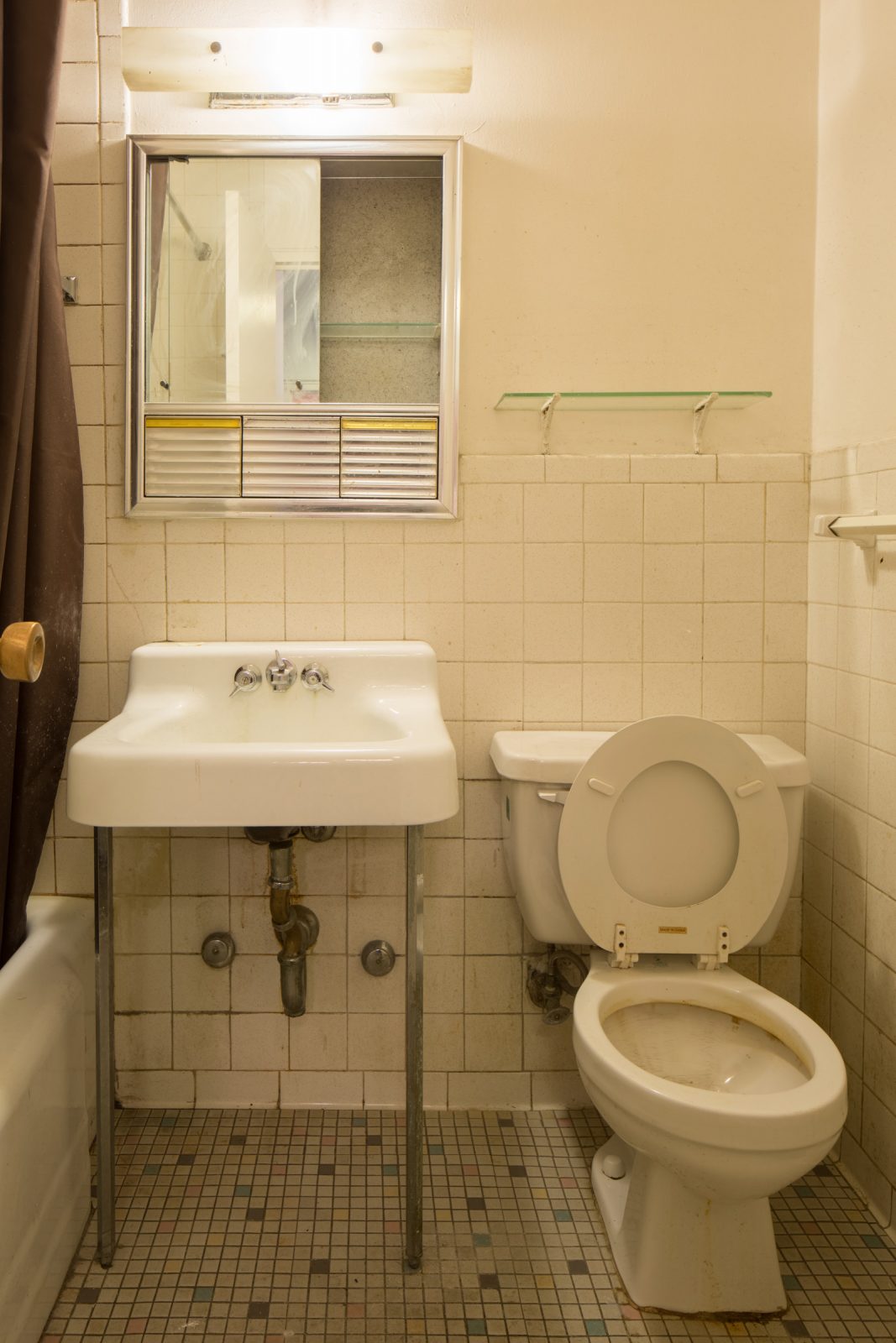
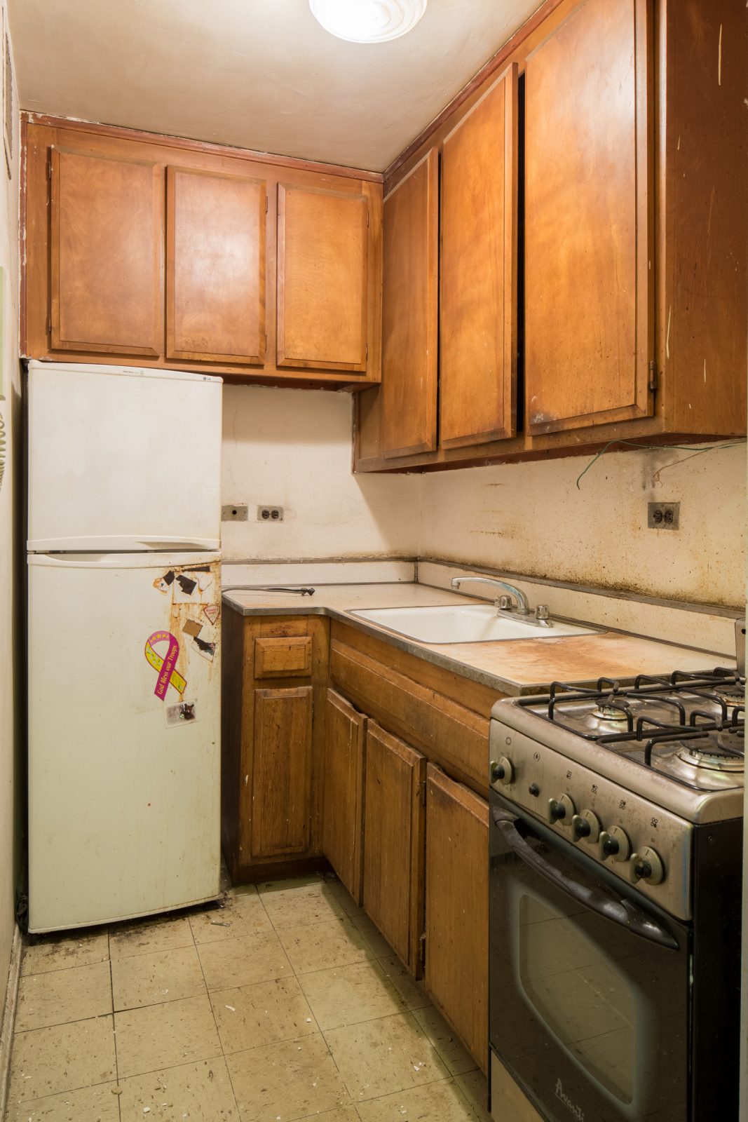
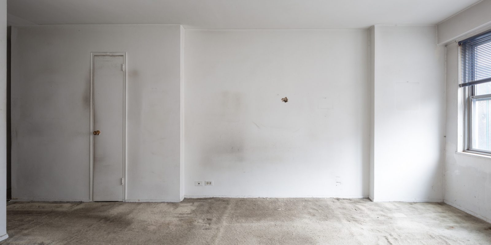
EP: Right. So long ago! I just remember feeling like, “Oh you definitely don’t want to touch any surface in there.”
AG: Oof yeah, the carpet situation, the walls…
EP: The bathroom and the kitchen were both unlivable by most modern standards.
AG: Which was great on one hand! I was like, this obviously needs a gut renovation and I wouldn’t be paying a premium for someone else’s taste.
EP: Or half-assed reno.
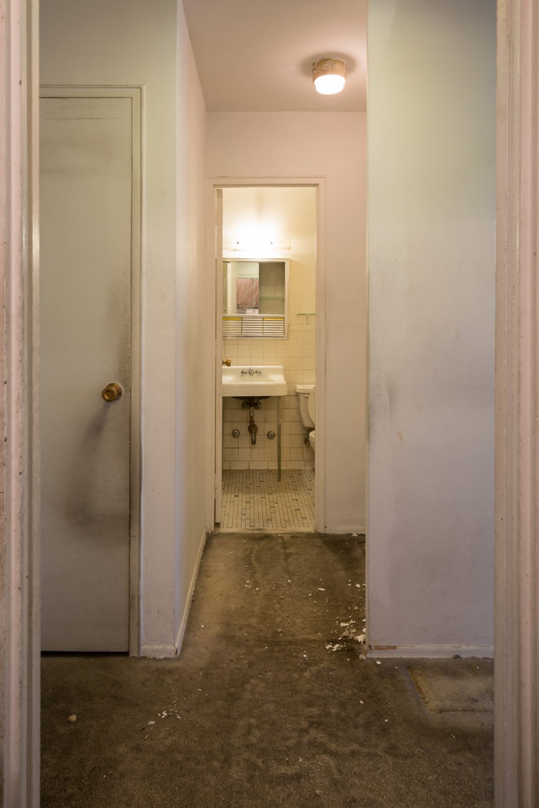
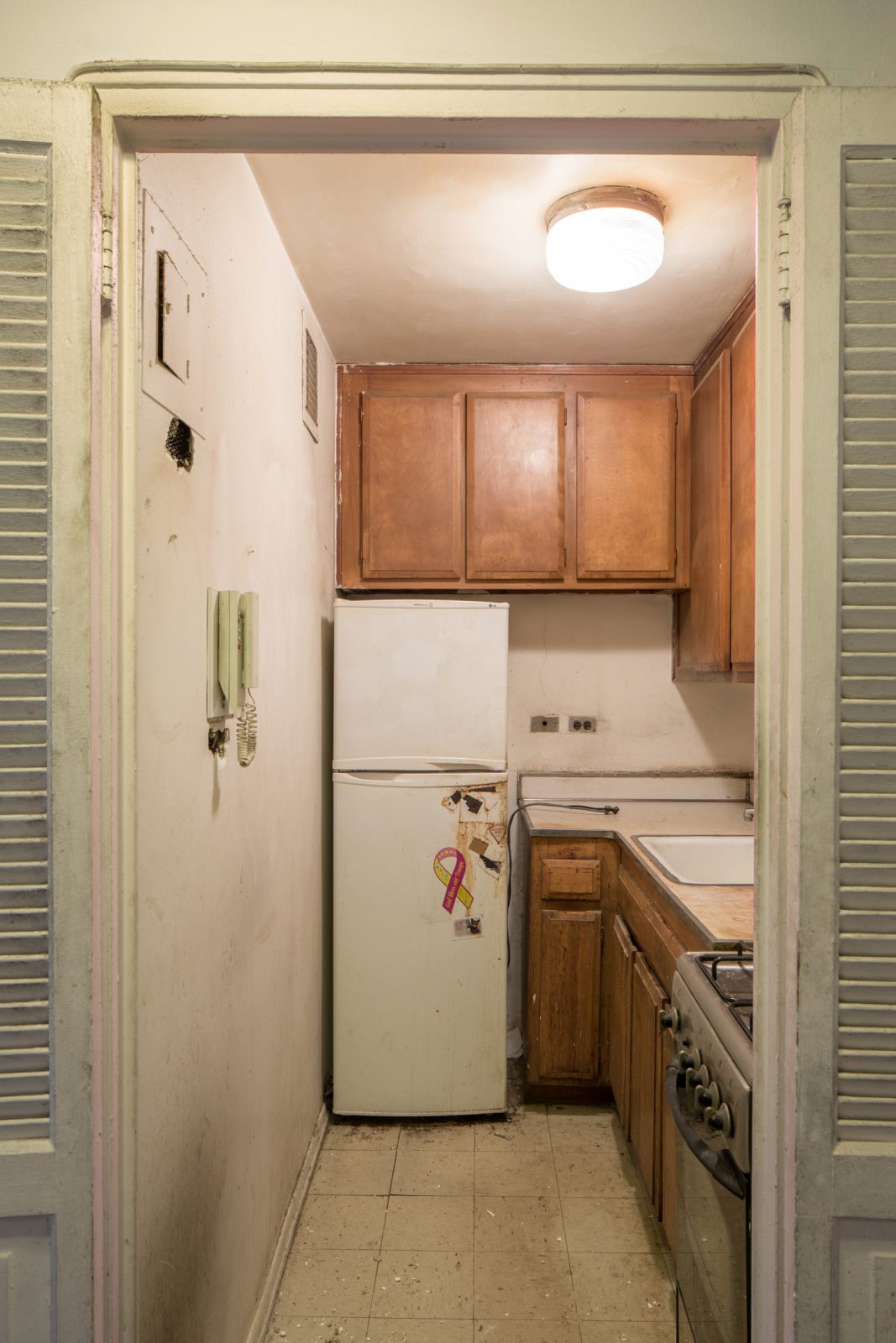
AG: Though, I mean I had no idea what I was getting myself into and what was going to be involved. After I actually closed on the property, I came to you and I was like, “Gahh do you want to work on this?” and we didn’t know it was going to be over a year of our lives and stress. We all thought it was only going to take three months, four months max… Fast forward two years…
EP: Yeah I mean it was hard to know! The carpet was completely covering an asbestos floor. It was also hard to know how difficult and strict the building was going to be. I hadn’t heard of a board being this vigilant before.
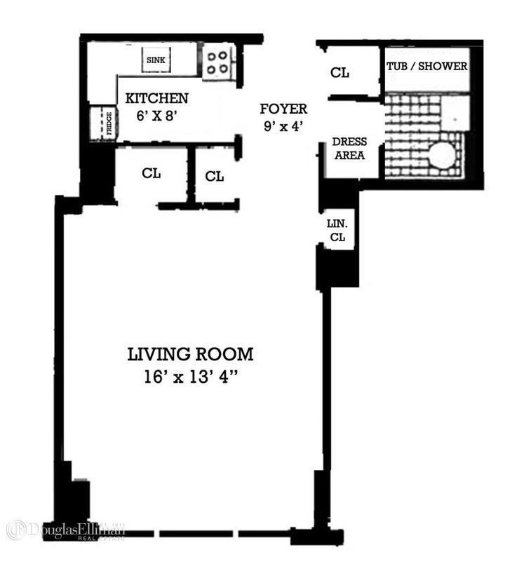
But I think it was pretty clear that if we were able to open up the kitchen, which judging by seeing some of the other units in the building, was somewhat tenable, that it could have much more of a contemporary feel. And despite its compact size, the layout is pretty efficient.
AG: Totally, and it had a surprising amount of closet space for a studio.
EP: Going back to when we first saw it, I saw potential. It was interesting because my photography really informs my design now, and designing for a photographer was always top of mind. How the light is going to come into the space and what the sight lines are going to be, focal points, etc. I think just having the experience of photography is always going to inform my design, which I think makes it stronger in some ways, because the visual impact will always be highly considered.
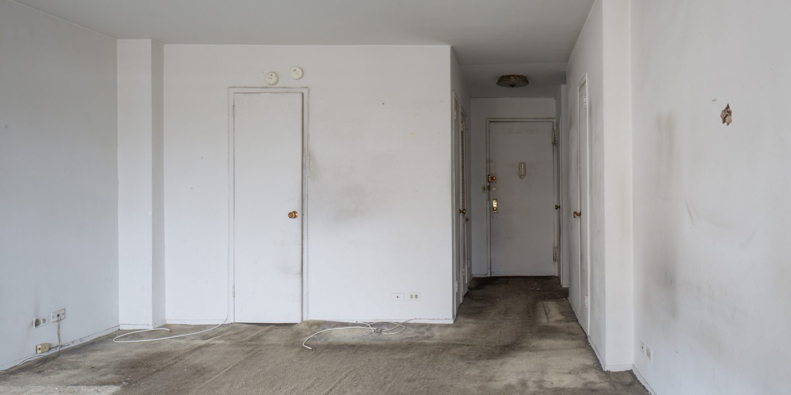
When we first came, there wasn’t that axis. It was a staggered hall and the closets were facing different directions. The closet near the door was facing toward the door, and to the right of the bathroom wasn’t even an enclosed closet, just an open alcove. And the lights were in different positions in the ceiling.
The kitchen door wasn’t aligned with the bathroom door. There was a weird jog. So my immediate intuition was to align that circulation. So you’d have a straight path in, transected with this kitchen/bathroom path. And everything would be organized off that.
AG: So when you’re starting a gut renovation project, what do you even start with? It seems so overwhelming.
EP: I just want to simplify everything and make the main volumes that you occupy as clean as possible. And that was one of the hardest things with this apartment. The walls have a lot of irregular jogs that are part of the structure. I originally wanted to fill in this alcove since it would make it a cleaner box, but the issue is the space is so small.
AG: Right, every square inch counts!
EP: There was structure in the kitchen if you remember, and we closed off this corner, and made it a very neat corner. The architecture has a little divot there so you did lose some square footage so that we could make a singular volume.
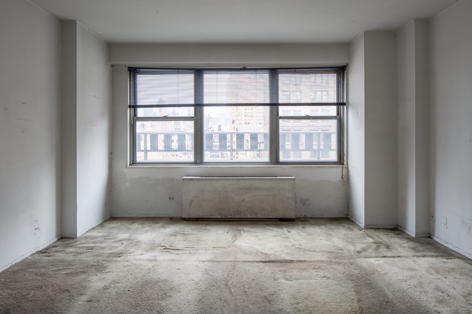
And below and above the window, there’s a soffit that comes into the room a few inches and what we did was put the roller shade in front of the soffit and brought down the face and made it all flat. That was dictated by the depth of the PTAC unit so we took the face of the PTAC unit as the limiting point. Hiding the PTAC and putting storage on either side was nice. It made the window wall as clean as possible.
AG: Remind me, when did we start looking at finishes?
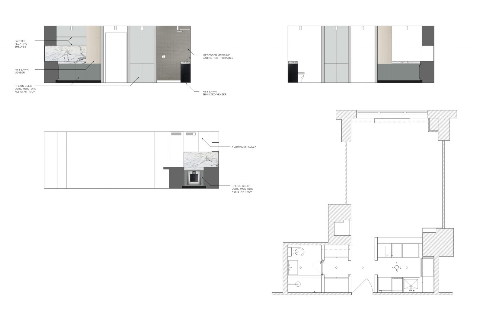
EP: It was pretty early on. And finding materials we loved ended up setting the tone for a lot of the final design. In the end, we actually never deviated that far from the rendered elevations.
AG: Oh yes, I loved when you sent me those!
EP: It might be fun to include those in the post.
AG: Done!
The next part of this conversation will explore the finished project and other challenges along the way.