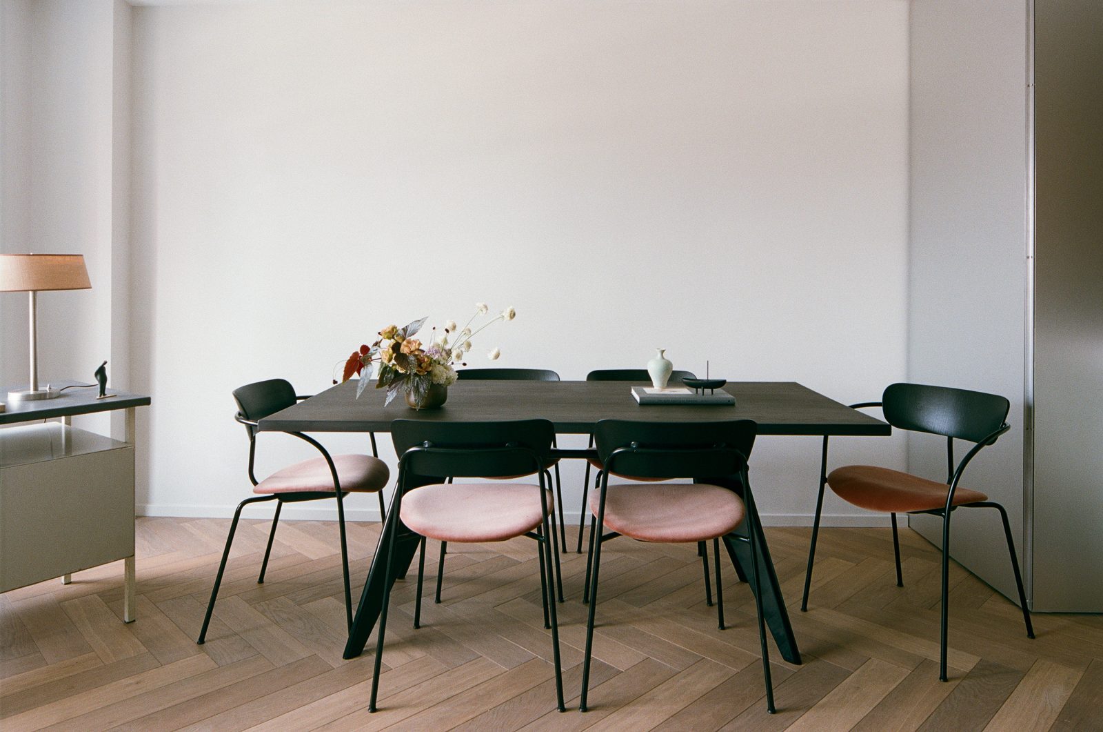
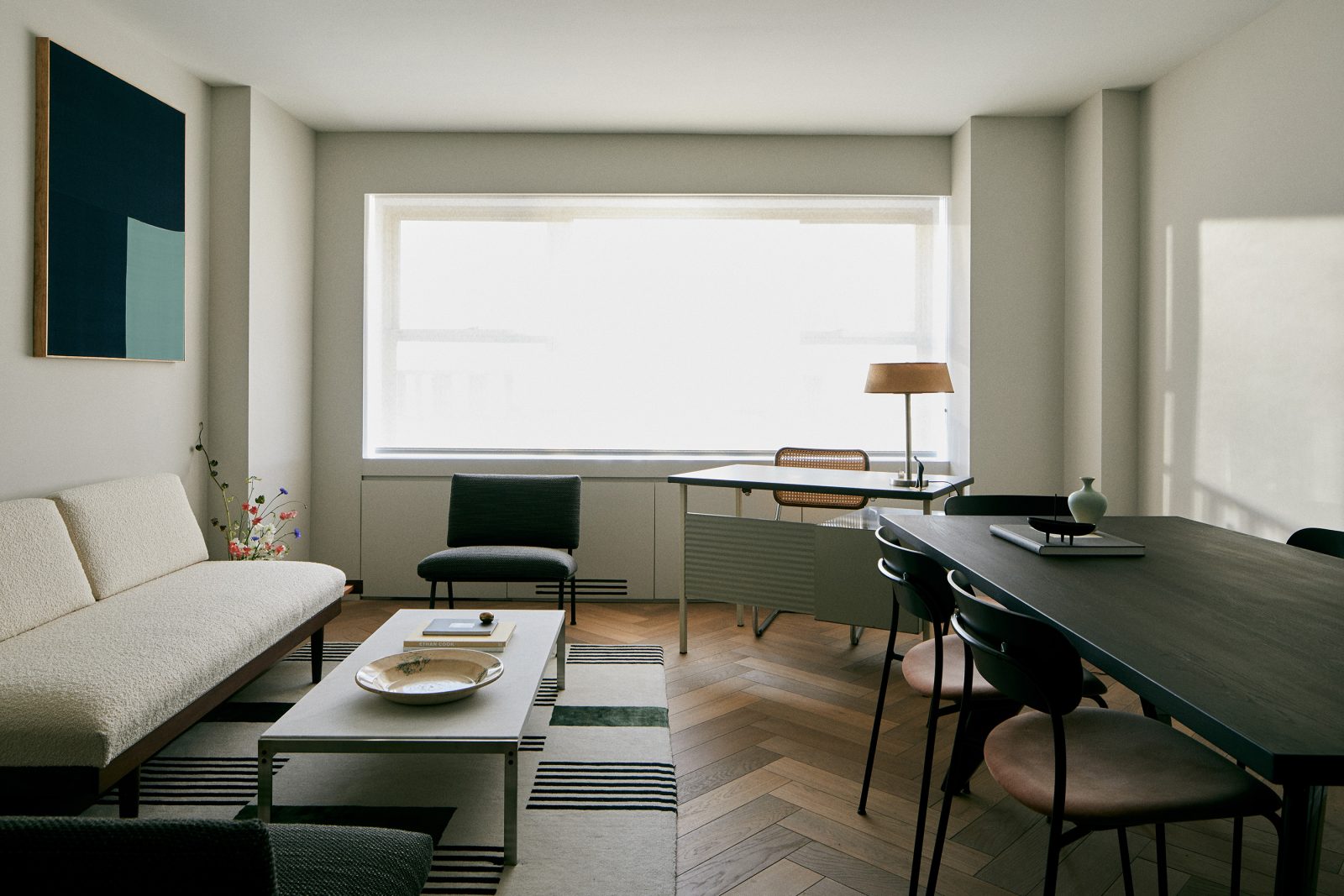
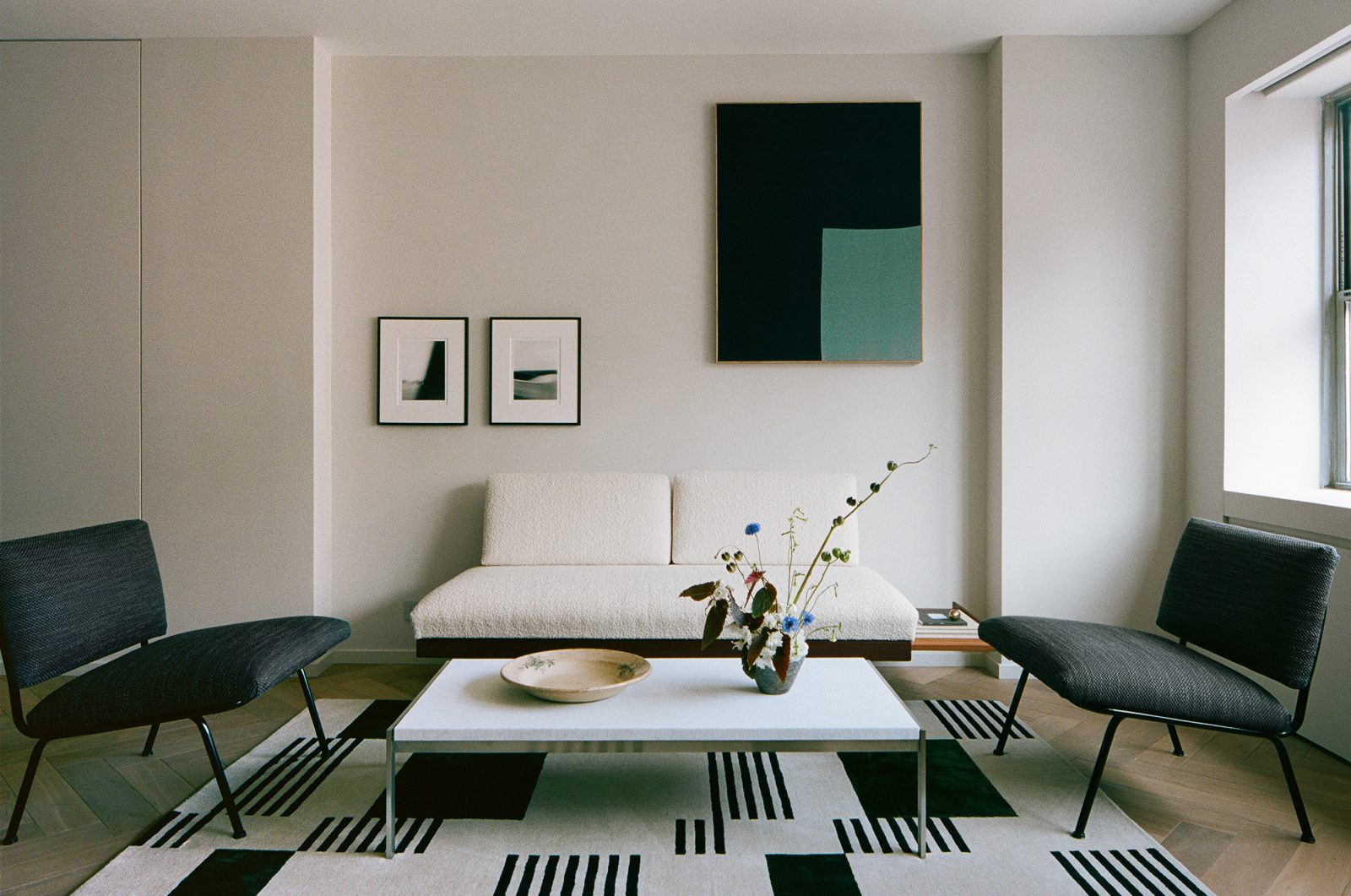
The second part of a conversation with Eric Petschek, friend and interior designer of “The Palace” (the endearing term we coined for the 384 square foot studio apartment in Manhattan I bought and renovated over the last two years and change). The space was designed to be my creative space and office more so than a living studio, which will explain some of the furniture choice/layout. Without further ado, we present the finished result.
AG: Did you have any particular inspirations for this space or designers you’re inspired by?
EP: For the design, I always tried to channel “you via me.” I would never design this for myself, but that said, it’s a design I stand behind and like a lot. I tried to take your sensibilities for color and texture and cleanliness and moodiness into account, and funnel that through my own lens for materials and details. And this is the result!
AG: If we had a kid..!
EP: And the gestation period took 2 years.
AG: Yes, this kid did not want to be birthed.
EP: My influences are generally contemporary Northern European architecture, broadly speaking. But there’s not a single design or designer that I looked to for inspiration, necessarily.
AG: And it’s tricky with all the code in NY. And working around that, as we’ve discovered.
EP: Not to mention working in old buildings that are really not conducive to clean lines and simplification. We have these exposed conduits and j-boxes that are proud of the ceiling because we couldn’t drill or otherwise touch the concrete slab above.
AG: Ohh, I didn’t even realize those were typically inside. At least they’re fairly sleek…
EP: They’re custom made by Lucifer for this very fixture, so yeah, as far as exposed junction boxes go, they’re about as minimal as you can get.
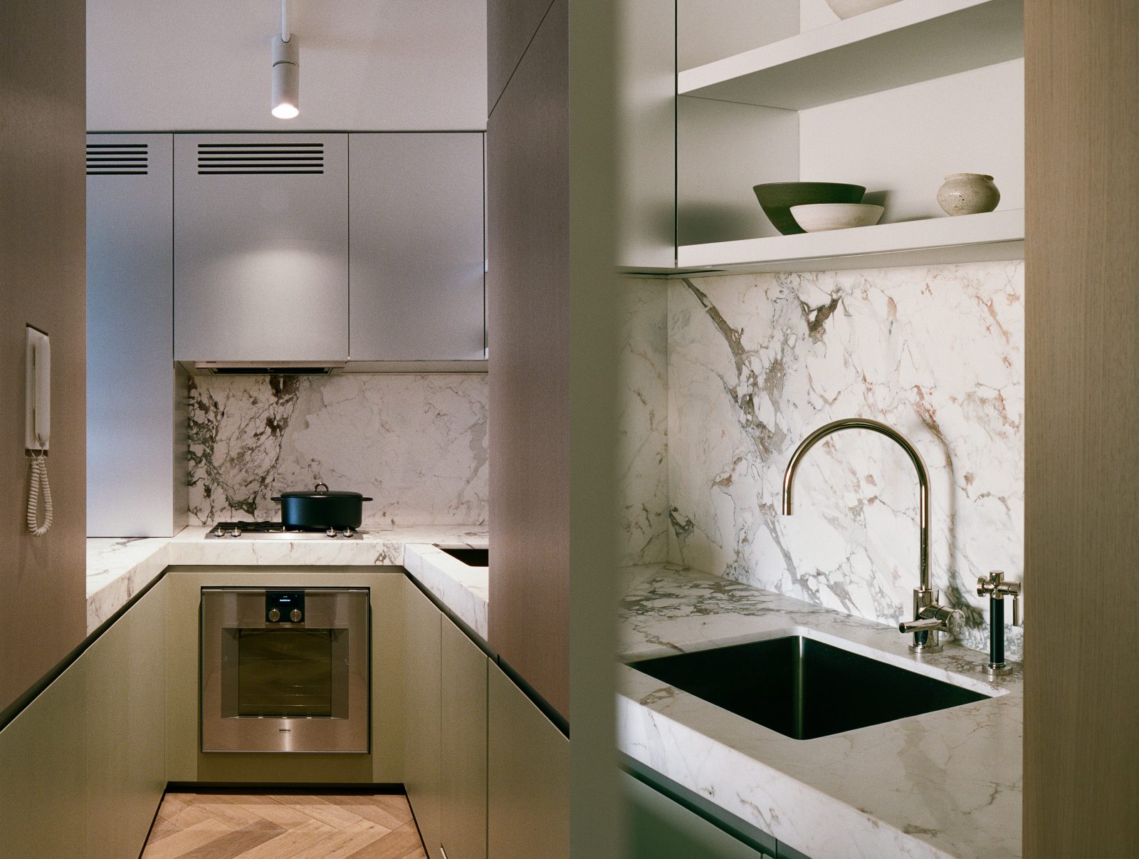
AG: The kitchen may be the most dramatic change. We went through several iterations of the kitchen to get to where we are now.
EP: The gas line location was a big consideration, as were the plumbing lines and electrical/intercom riser.
AG: And at first we wanted to do an induction top!
EP: Right, and the apartment’s load letter ended up showing that it couldn’t support the power draw of an induction cooktop, so that was a short conversation.
AG: I remember we thought about doing the sink where the current stovetop and oven are, but actually I’m glad it didn’t end up there. Then we’d have the bathroom sink and the kitchen sink in the same axis. Now it’s a bit more staggered, so it’s nice.
EP: I joke with people that on one end you have fire, and at the other you have water.
AG: Ha!
EP: But I agree, I think it worked out well in the end. And it’s nice to have the sculptural Dornbracht tap facing the living space.
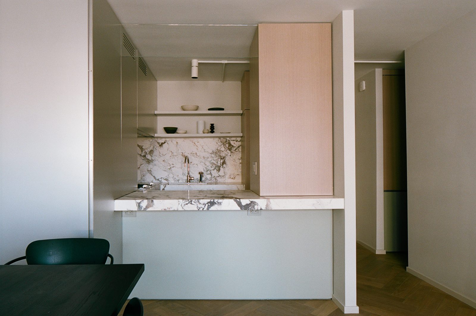
It was tricky because we consulted with several plumbers about how far we could potentially move the gas cooktop from the riser, and each had a different take on what you’d assume would be a very cut and dry code issue. In the end it was determined we COULD snake the feed from the riser, behind the dishwasher, under the sink, and to the cooktop’s new location. Another obstacle was that gas riser’s location near the entry but 3” outside of the wall. If we put an appliance, like the fridge, in front of the riser, it would have to be more shallow than your average counter depth in order to maintain the circulation space/axis with the bathroom. We got super lucky that Gaggenau offers such a compact fridge in what is otherwise a very luxe (and large) appliance lineup. And then there was the hurdle of providing access to the valve where the gas branch meets the riser… but enough about the gas line. Hate those things.
Once we picked the fridge, I designed the volume across from it, which would hide the building’s electric and intercom risers, to be the same dimensions, maintaining the strong symmetry along the axis.
AG: And the materials for the kitchen we kind of had an idea of fairly early on. We obviously both fell in love with this stone, and that kind of tied everything together.
EP: Right, we established the color scheme in here pretty early on. There were some materials I was “dead set” on using, like the aluminum, and some you were, like stone. I think I may have tried to point you in the direction of more durable and affordable countertop options, but oh so glad the budget was elastic enough to use this statement stone. It really does tie all of the finishes together.
AG: Well yeah, you convinced me about aluminum! I was so skeptical at first.
EP: Yes, I was super excited about using aluminum. And I think it looks really great. It’s hard to find quality aluminum vendors in the US for a project of this scale, but I think it turned out well. The thinking behind the aluminum was to help bring light into the space because it’s marginally reflective. I know you and I feel similarly about reflective and glossy surfaces: we’re typically adverse to them. But aluminum is matte enough and the subtle reflectivity suggests greater depth; it almost makes the room feel a little larger. Surfaces that die into it slowly vanish. If you look at where the counter meets the panel, for instance, it slowly dissipates.
And I also knew that the kitchen would be the darkest part of this north-facing room, so I thought the aluminum panels would help carry some light farther into the space.
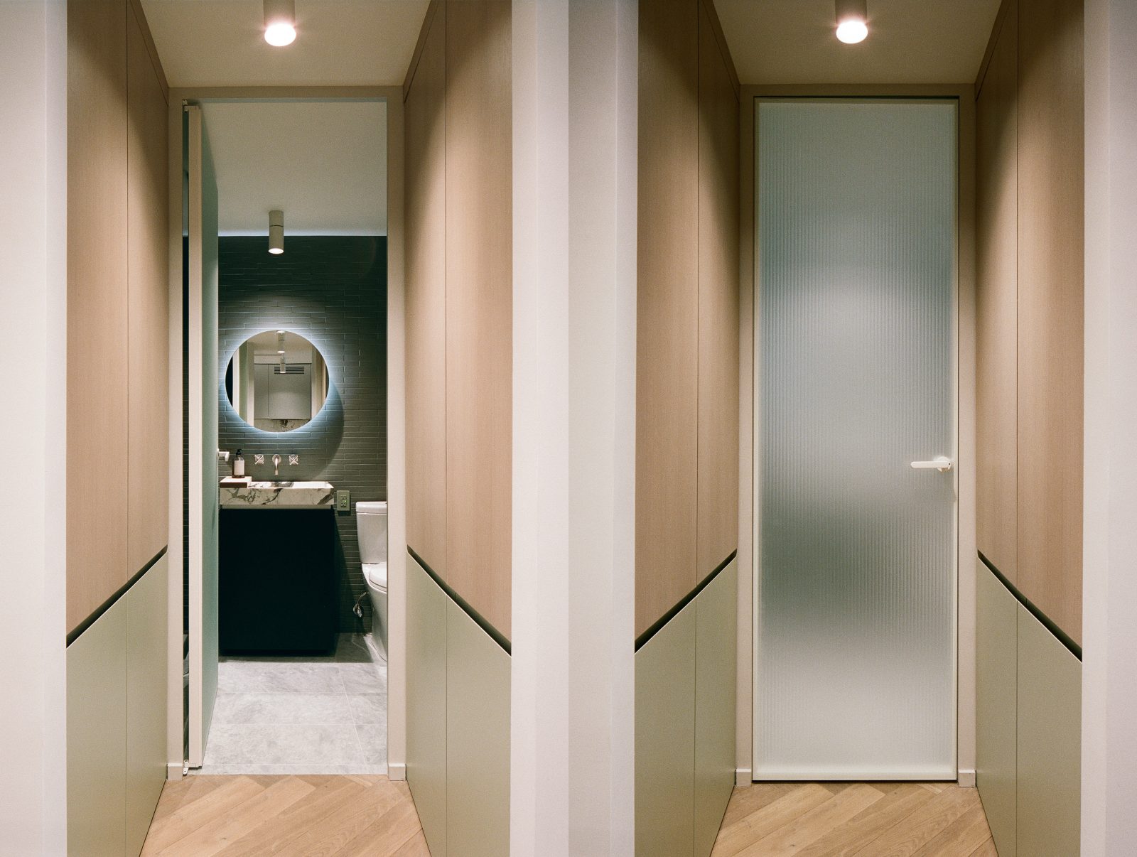
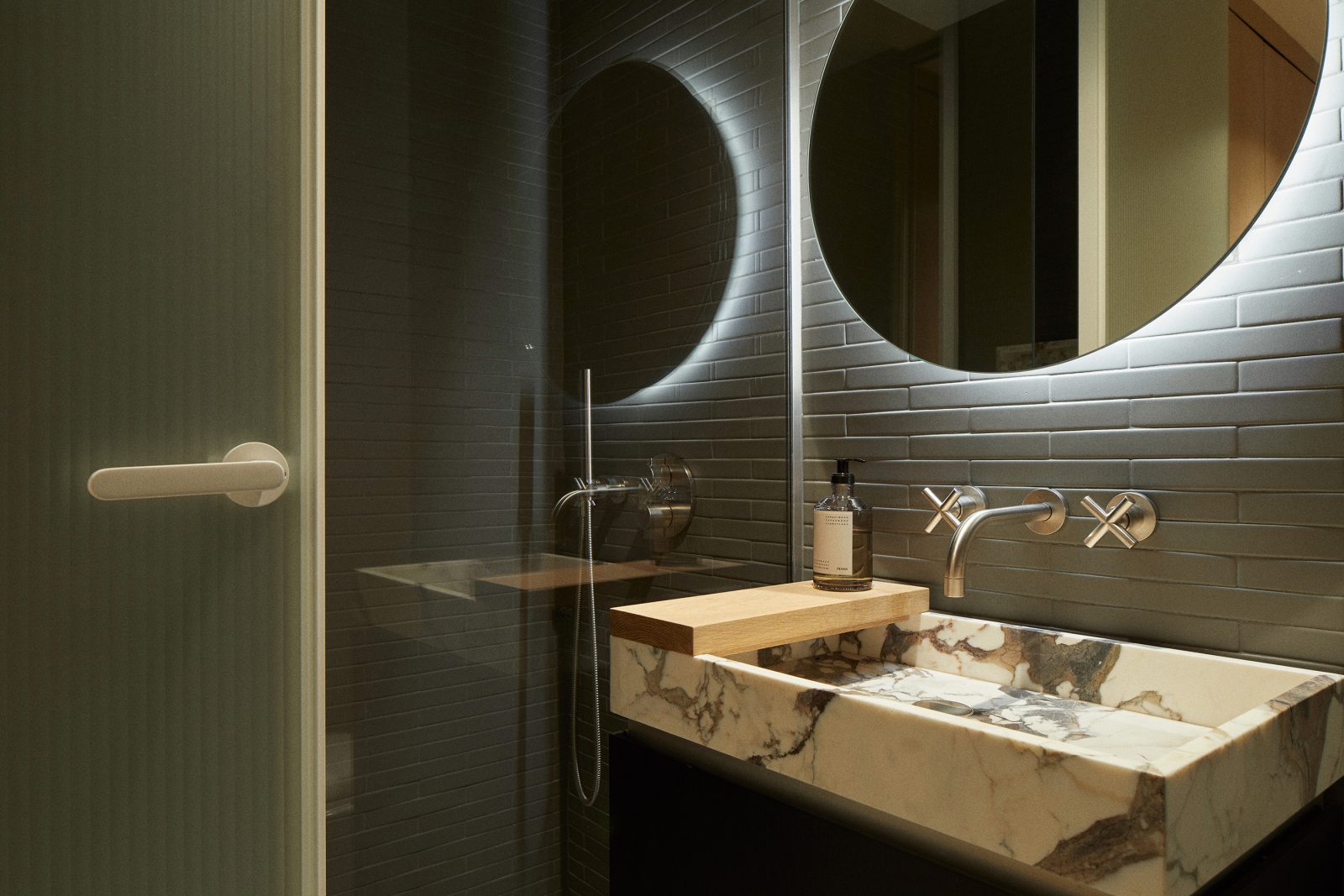
EP: Sadly, there was no opportunity for the bathroom to receive natural light, so I knew the choice of light and material would be very important. Mutina is an Italian ceramic tile brand I’m very fond of. It’s hard to find matte tile in interesting proportions. Everything you’ve either seen before, or often times ceramic tile doesn’t have a great finish, but this Mutina line by Barber & Osgerby is nice in that it offers a simple tile but in a really unique color and size. And despite being matte it’s still appropriate for wet areas.
AG: And you also knew you wanted this tile early on. I remember it was in some of the early renderings. And I was like, “Show me cheaper tiles dammit!”
EP: Hah yup. And after showing you others you were like, “yeah these other options suck.” When we went to purchase them there was very limited quantity since this color was discontinued.
AG: I bought the last remaining stock!
EP: This particular one is hand-made so there is character in the tile, there’s some intentional unevenness. And I knew I wanted to highlight this by grazing the tile wall with a light, which is what the LED around the custom, round medicine cabinet does.
AG: Yeah and we went with a darker, moodier bathroom in general. I guess we brought in the lighter floors since everything else was darker.
EP: One of the most striking materials apart from the stone is the glass on the bathroom door. You knew from the beginning you wanted this Glas Italia door! Because you photographed Avenue Road where they have several versions, and you fell in love with it there. God knows I didn’t put up a fight! Everyone loves that door.
AG: Oh yes, it’s amazing.
EP: I love that because it’s translucent you can vaguely make out the medicine cabinet light beyond even when it’s closed. I think the transparency also helps make the space feel larger.
AG: The bathroom sink is also so nice. I guess almost the whole bathroom is custom.
EP: I love that you were open to having a sink basin built from the same stone as the kitchen. But I guess once you bought the slabs we had the material… That said, we only baaarely managed to tetris the very large kitchen countertops and backsplashes with the bathroom sink and niche onto two slabs. In the end, I think that the apartment feels as nice as it does because almost everything is bespoke. You can really sense that in the 384 sqf that everything was considered and built specifically for the space.