This guest post is brought to you by Eric Petschek – friend, partner-in-crime, photographer, and designer of The Palace.
In collaboration with Gaggenau.
Designing a kitchen presents unique challenges when renovating an interior. Unlike other rooms in a residence where the interior architecture plays a supporting role to furniture and objects, the kitchen is a one-person performance: the architecture is the room. The design is fixed. No sofas to jostle, no rotating lounge chairs, no ambulatory lamps or tables, and no pillows to substitute on a whim. There are good reasons for the immutability of the kitchen: it’s full of equipment that has very real technical demands—dedicated power feeds, gas line locations, water connections, drainage requirements—as well as being a high-use, high-function space where ritual and repetition benefit from familiarity.
In kitchens as small as the one in Alice’s “Palace,” many decisions have been made already, dictated by the building’s idiosyncrasies and appliance sizes. Laying out the kitchen is a bit like a game of high-stakes Tetris; multiple orientations are possible, but the pieces only come in select shapes and sizes. And like in Tetris, don’t leave gaps. In order to avoid the latter blunder, critical given the very limited space, we opted to work with a millworker (as opposed to using off-the-shelf options like those made by Ikea) so that we could build custom cabinets, drawers, and appliance enclosures to maximize usable space. Using a millworker also allowed us complete freedom when it came to choosing materials.
Settling on appliances was the first step before laying out the rest of the kitchen—their dimensions are non-negotiable and their locations, largely governed by existing conditions, a driving factor. Integrated vs freestanding appliances is also a consideration, but my penchant for clean lines and fewer materials meant that this was a foregone conclusion: integrated. And then there’s figuring out which appliance brands to specify, a loaded topic that for most is a calculation involving brand recognition, loyalty, budget, and individual taste. Personally, I’m partial to Gaggenau for their best-in-class performance across product categories and their seamless, contemporary appearance—in my opinion they do integrated appliances better than anyone—so we used their products throughout.
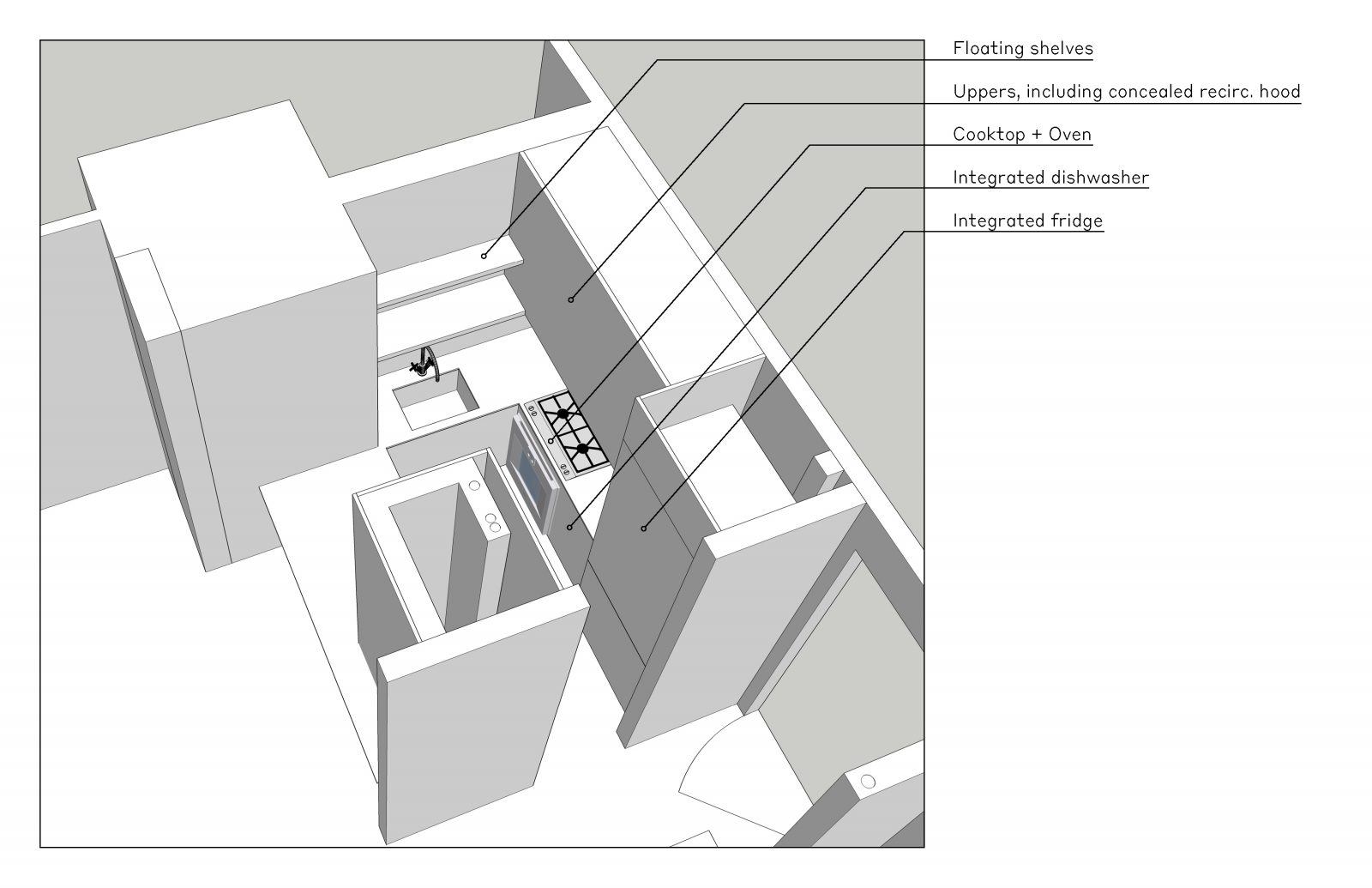
In the end we landed on using the most compact appliances on offer from Gaggenau:
- Refrigerator: 22″ Two-door with bottom freezer (RB 280 704)
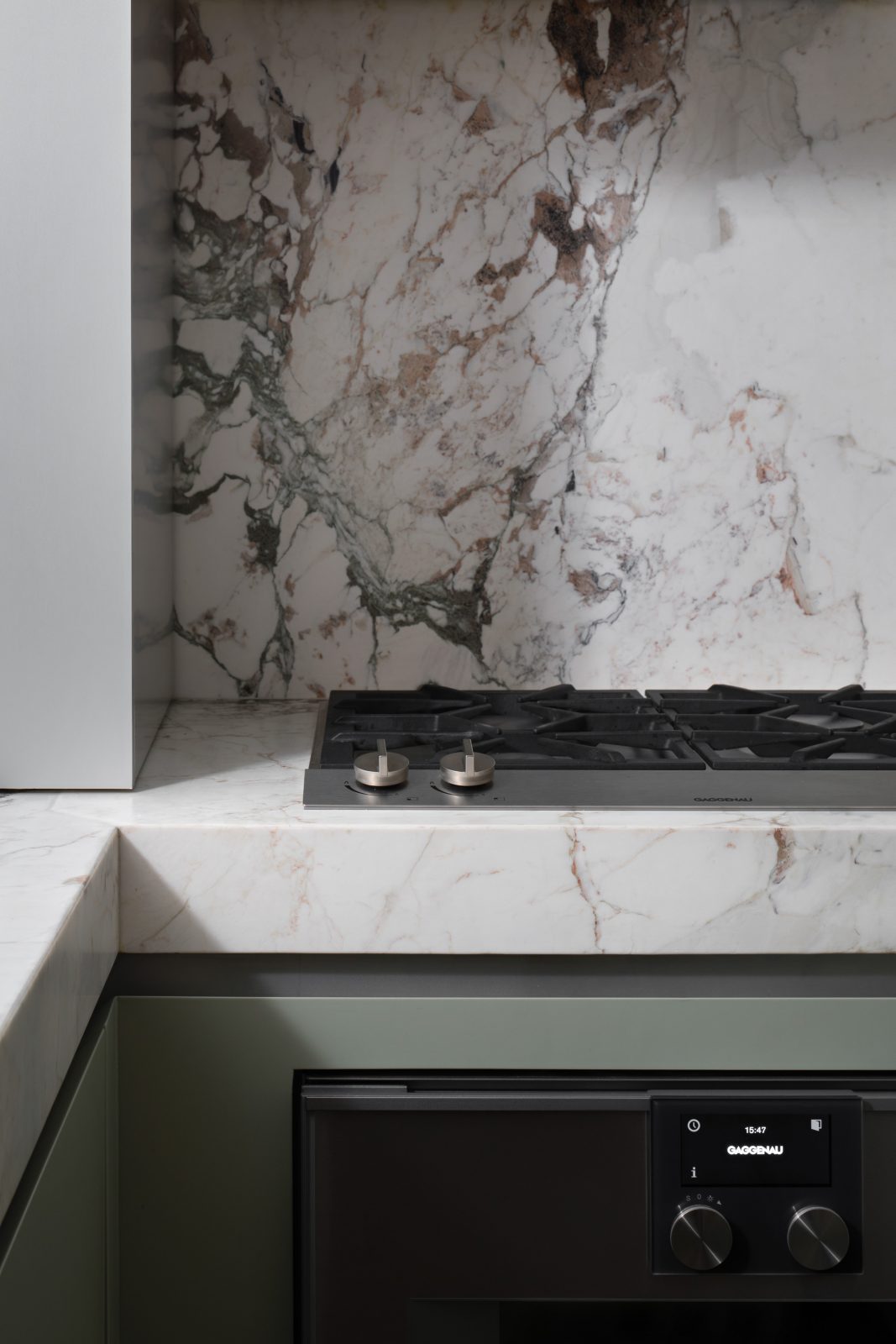
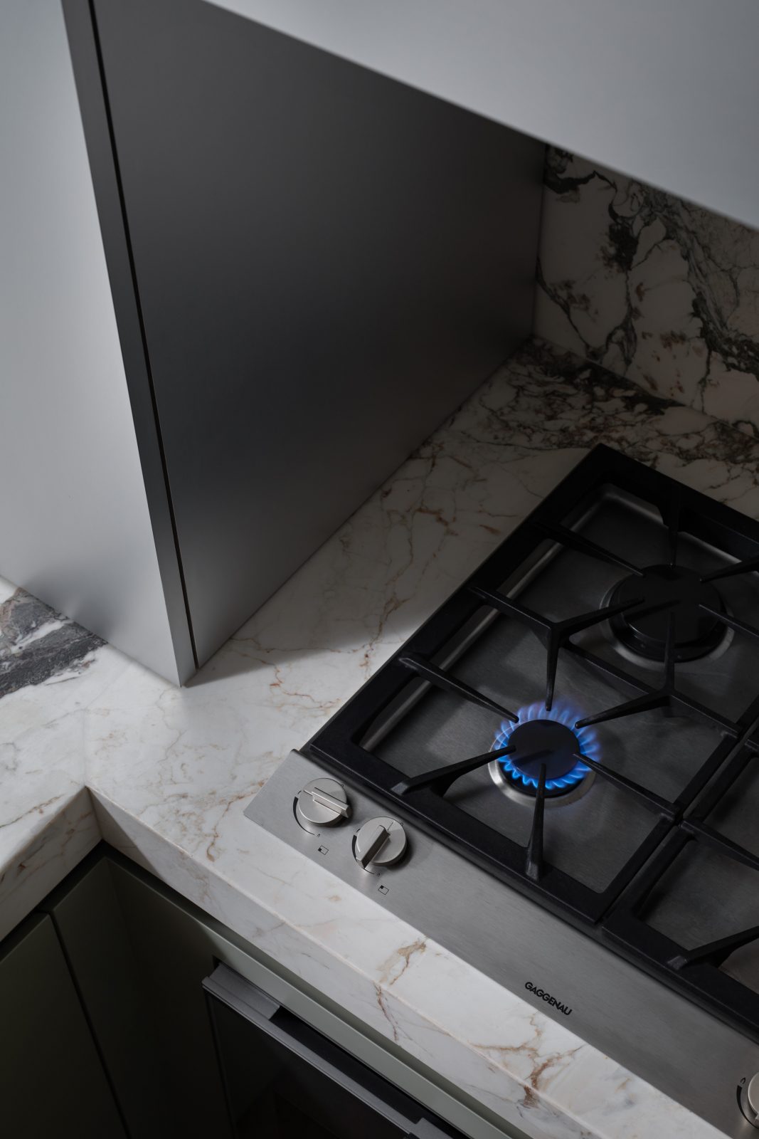
- Cooktop: 24″ Vario 200 series four burner gas cooktop (VG 264)
- Oven: 24″ 400 series single oven (BO 450)
- Hood: 24′′ 200 series Visor hood
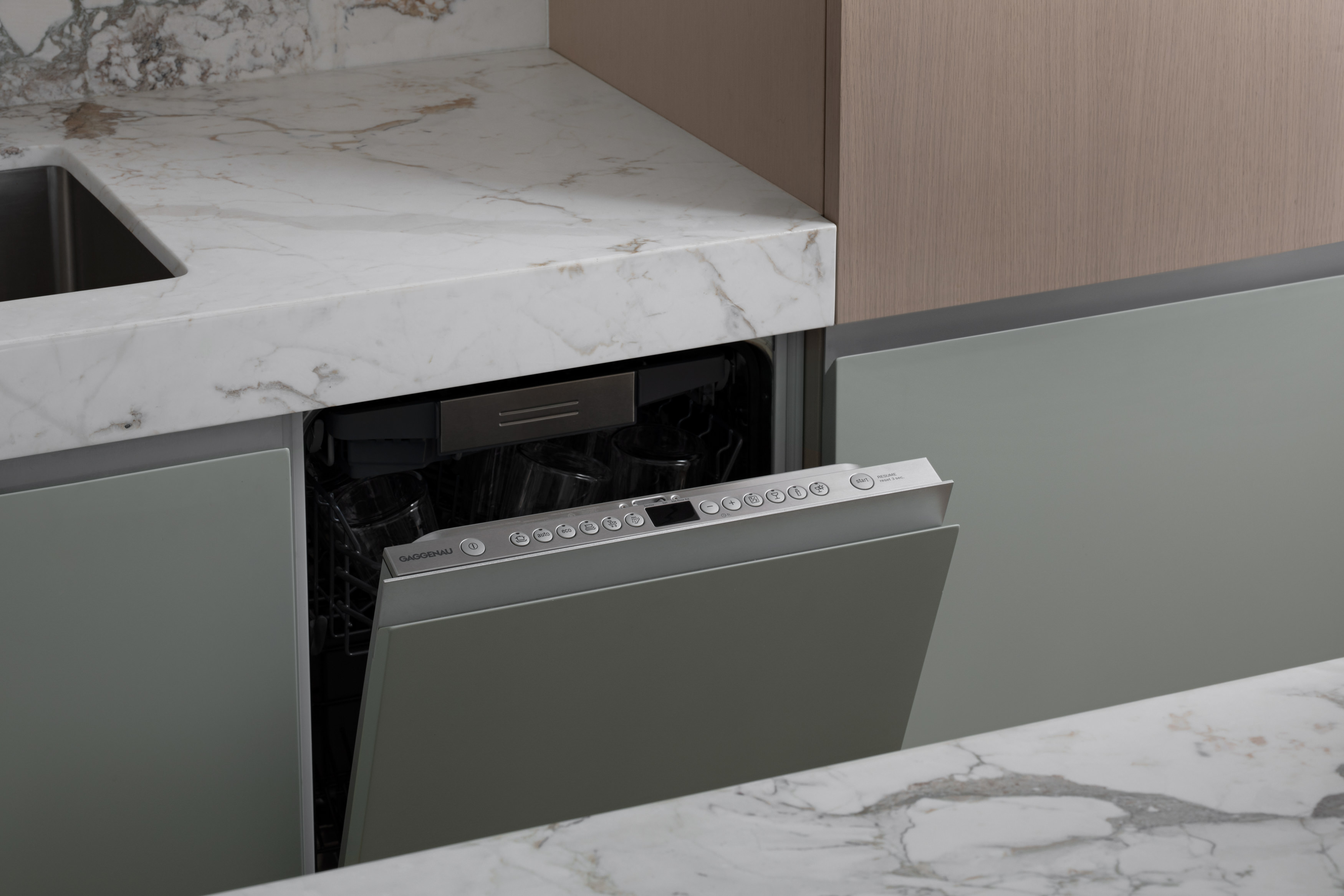
- Dishwasher: 200 series fully integrated dishwasher
Gaggenau is one of the few appliance brands that not only makes appliances in every product category, but also delivers superlative performance across them. Their cooktops, ovens, refrigerators, even their dishwashers are widely considered to be the gold standard in their respective categories. This means that you have the benefit of being able to use a single brand for everything. This continuity has aesthetic advantages as well. Gaggenau has designed their appliances to share a common design language. Knobs, dials, buttons, symbols and even fonts are all shared for the ultimate in continuity. If you’re OCD like me, this is is a real boon.
Deciding on finishes, while a daunting task given the limitless options, turned out to be a quick and relatively easy step. My familiarity with Alice’s taste combined with my own material predilections, namely for a mixture of clean surfaces and those with texture, meant that decisions were quick and easy. In fact, early on I sent Alice a quick Photoshop sketch of colors and materials rendered on top of elevations made in CAD and she immediately responded in the affirmative.
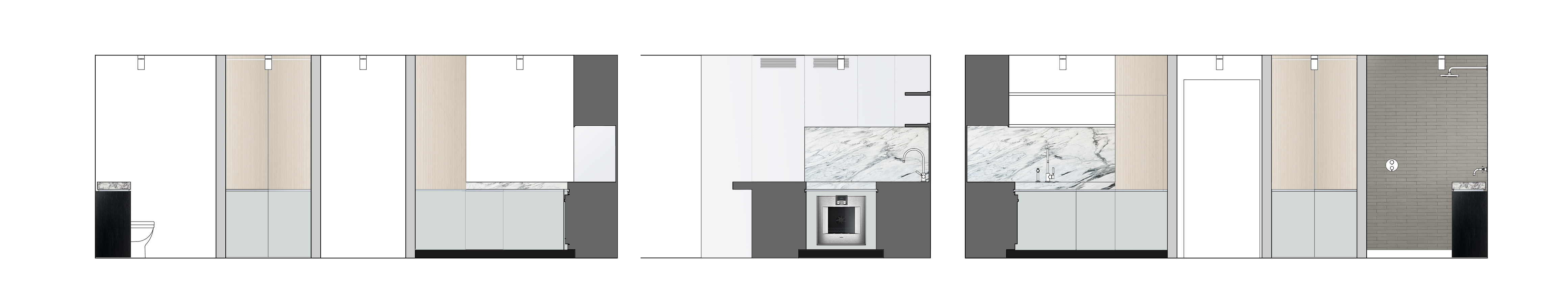
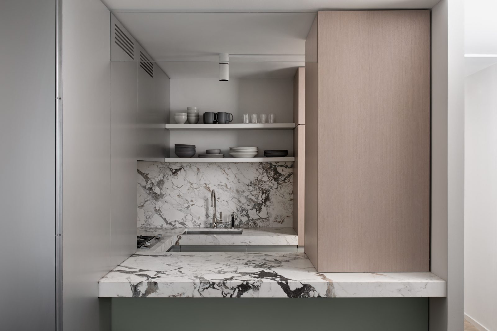
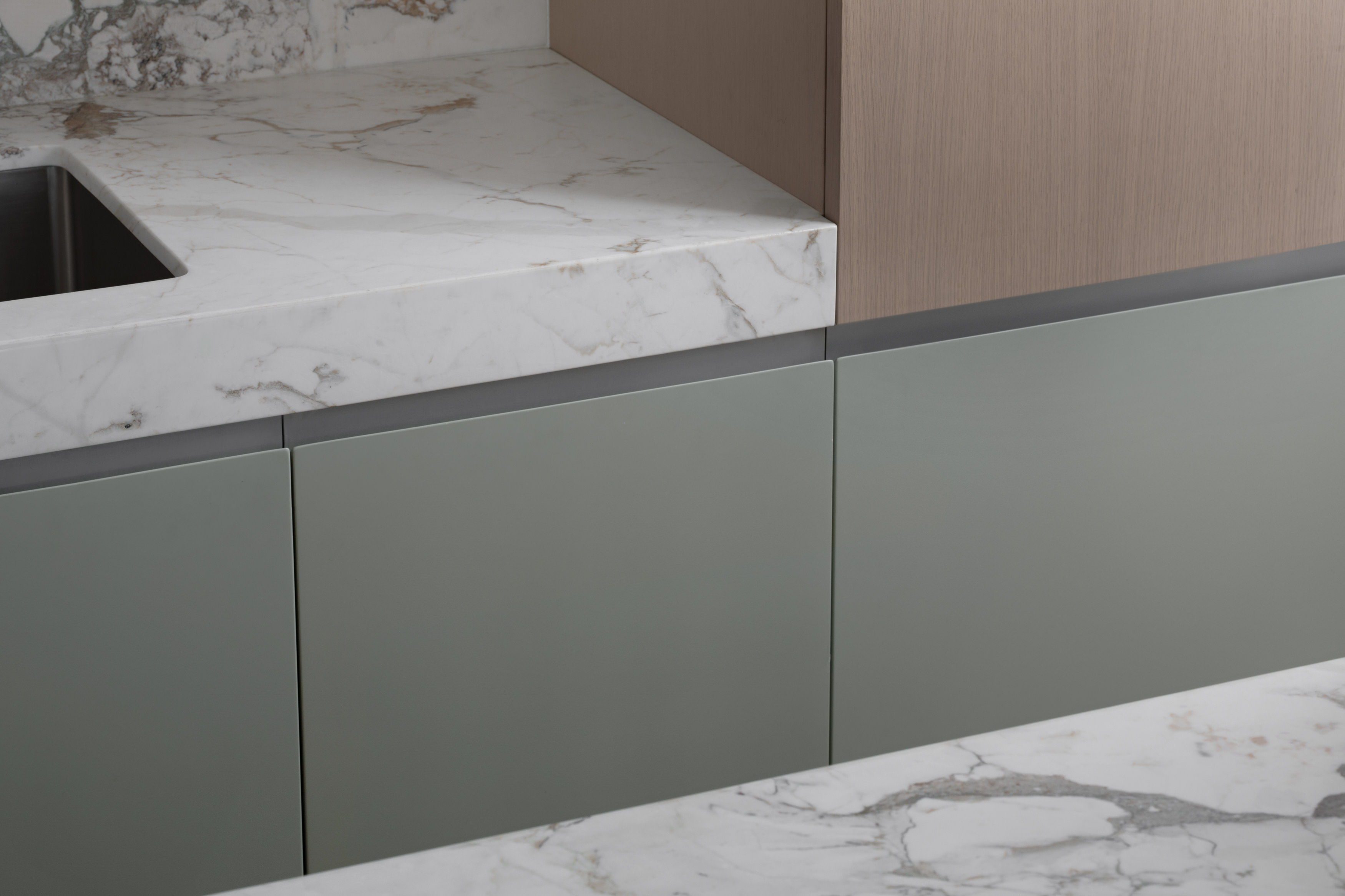
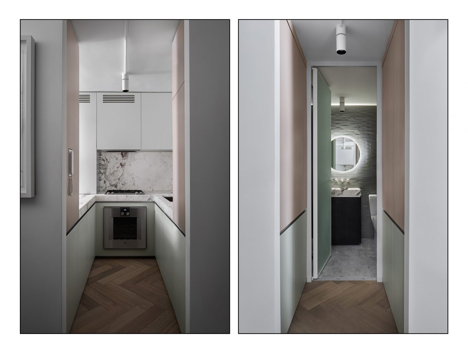
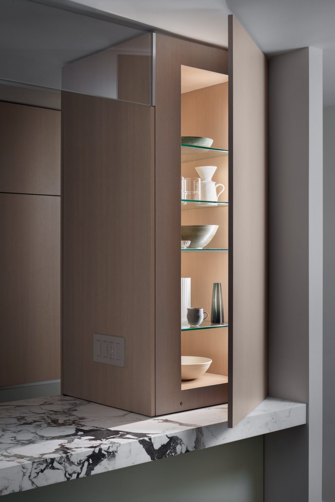
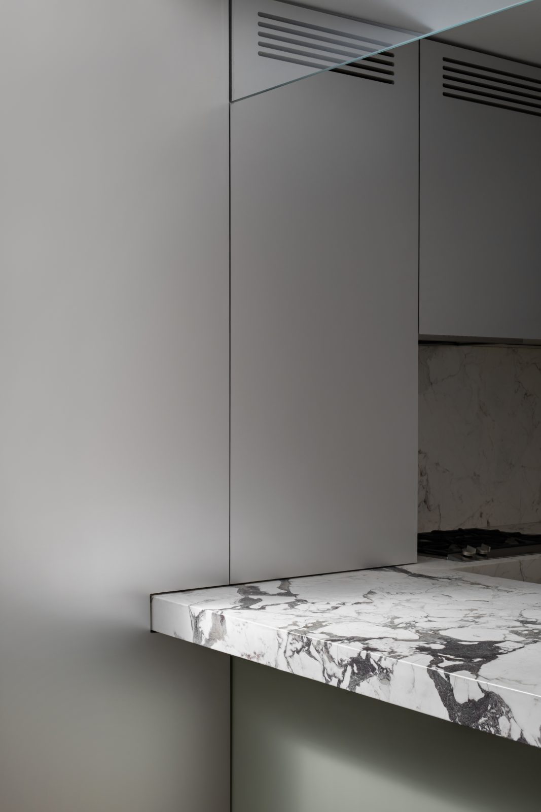
If studying interiors at Pratt taught me one thing, it is that great design is not the result of arbitrary decision making, but rather considered moves that subscribe to a broader vision for a space. To help inform the design of the Palace, I made up a couple of “rules” that dictated where to use which materials. The countertop is at height predetermined by its functionality: 35”. To give the stone countertop the appearance of being a substantial volume, akin to a block of stone, a second, vertical slab of stone is affixed to the front in what is called a “mitered apron.” In the bathroom the apron is turned upside-down and forms the sink basin. Below the stone apron runs a ribbon of aluminum that circles the entire kitchen-bathroom axis. The aluminum is the backing for the pull on cabinet doors, the dishwasher, the freezer, the bi-fold closet doors down the hallway, the bathroom vanity, and on panels that are fixed like the intercom and oven panels, it is also applied for continuity.
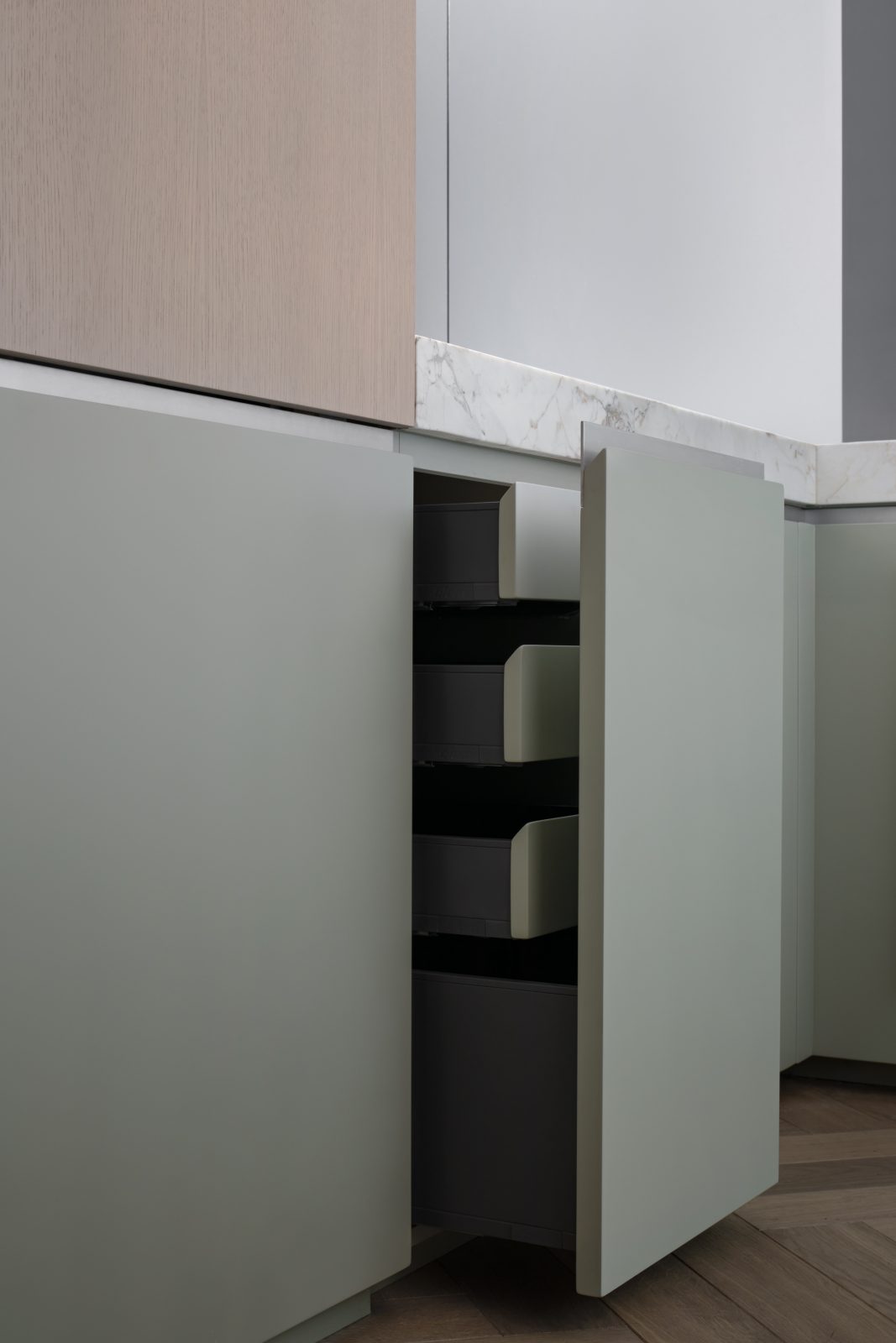
The lower panels, which span from the aluminum band at the top all the way to the floor (or nearly—there’s an undersized 2” kick), are painted in a matte lacquer color-matched to Farrow and Ball’s “Blue Green.” To maintain the appearance of stacked volumes, the lower panels are all full-height. Drawers are hidden behind taller front panels, also on glides.
Panels above the aluminum band are rift-sawn ash veneer. Rift-sawn refers to the angle at which the veneer pieces, or “flitches,” are cut with respect to the growth rings, and this particularly labor-intensive cut yields a more even grain pattern—you get the texture of wood without the visual interest of obvious grain patterns.
The volume at the end of the axis is treated as a separate, foreign entity that intersects with the kitchen, so we clad it entirely in aluminum. It encloses the building structure, the Gaggenau hood, and a Le Mans unit that makes the corner storage more easily accessible. The aluminum block is perforated by two sets of elongated pill shaped cuts, grills for the building exhaust and the recirculating hood. The aluminum is subtly reflective so it helps to usher trace amounts of natural light into the kitchen. Additionally, the reflectivity almost gives the sensation that the kitchen extends past the panel faces, obscuring the confines of the space.
These are some of the many rationalizations that informed the final design. The overarching desire was for cleanliness and simplicity made rich by the inclusion of subtle contrasts that provide tension. The interplay of cool tones with warm, textured surfaces with uniform, patterns with solids, soft with hard, expensive with economical, work to create a dynamic kitchen that is minimal, usable, and contemporary.